Last Updated on June 21, 2026 by Deon
Success in the quick-paced world of forex trading mostly depends on making informed selections based on precise market analysis. Traders must be skilled in reading forex charts if they want to successfully navigate the dynamic currency in the exchange market. These charts are essential tools for gaining important knowledge on price changes, trends, and openings. To arm traders with the knowledge required to depict market patterns, we will deliver a step-by-step guide on how to interpret and analyze forex price charts. Stay tuned.
Understanding Forex Charts
The price changes of currency pairs over a given period are graphically represented in a forex chart. The chart shows the period on the horizontal axis. On the other hand, the rate at which one currency is being exchanged for another on the vertical axis. These charts are used by traders to spot trends, forecast future market moves, and evaluate the latest price information.
Additionally, forex charts show you the exchange rate levels at which the market has historically flipped to the upside. More so, it also indicates exchange rate levels below which buyers typically place offers. These are referred to as support levels since the market finds support there when attempting to move lower.
What are Chart Patterns?
Forex chart patterns are formations that commonly appear as a visual representation. It can predict future market movements. Some of the typical chart patterns include:
Head and Shoulders
It has a head-shaped peak in the middle of two shoulder-shaped summits. Typically, this pattern denotes a change in trend.
Double Top Bottom
A currency pair forms a double top pattern when it makes two successive highs at the same level. It indicates a potential trend reversal. On the other hand, a double bottom pattern suggests a possible reversal.
Triangles
When connecting lower highs and higher lows, it results in the formation of triangles. These signals indicate the possibility of a market breakout.
What are Resistance and Support Levels in Forex Charts?
When reading forex charts, it is important to cram some terms for better understanding. Technical analysis terms such as support and resistance levels can be seen on currency charts.
A price level known as support is the one where a currency pair typically finds purchasing interest and stops further declines. On the other hand, the price level at which selling pressure prevents the currency pair from climbing any further is known as resistance. Traders can use these levels to determine probable entry and exit positions.
Forex Chart Technical Indicators
Traders frequently use technical indicators to supplement the data obtained from forex charts. But what are the technical indicators in the world of forex exchange? These are mathematical computations based on previous volume and price information. The RSI, MACD, and Bollinger Bands are some well-known technical indicators in forex charts. Every indication offers a fresh perspective, assisting traders in making wise decisions.
Traders utilize a variety of indicators on the Forex chart to analyze price changes, and spot trends to make wise trading decisions. These indicators are based on mathematical computations and past price information.
Forex Chart Trend Lines
On a Forex chart, trend lines are drawn directly to connect several price points. These trend lines can be either highs or lows. They aid traders in evaluating the market trend’s direction and probable turning points.
Common Forex Chart Types
Candlestick charts have dominated the forex market. It is because candlestick charts are the most common style of chart among Forex traders. They reflect price activity attractively. In other words, they make it simple to evaluate the chart and spot chart patterns, among other things.
There are various kinds of forex charts available in the market. Each one provides a different perspective on market developments. The line chart, bar chart, and point-and-figure chart are only a few examples of more chart kinds. Let’s examine them now.
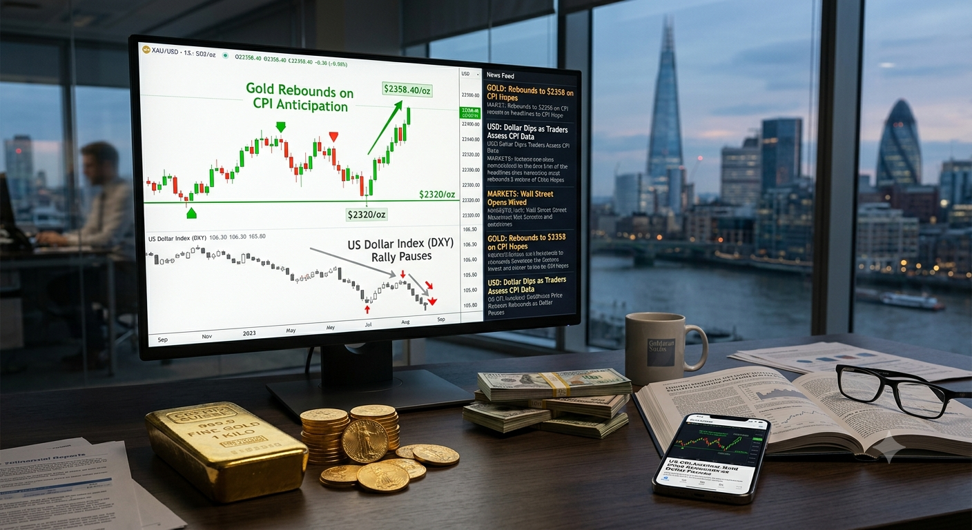
Reading Forex charts is one of the most important skills for any currency trader. A Forex chart displays the price movement of a currency pair over a selected period, helping traders identify trends, support and resistance levels, and potential trading opportunities. The most common chart types are line charts, bar charts, and candlestick charts, with candlesticks being the most widely used because they provide detailed information about market sentiment.
When reading a Forex chart, traders should first determine the overall trend. An uptrend is characterized by higher highs and higher lows, while a downtrend shows lower highs and lower lows. Sideways or ranging markets occur when prices move within a defined area without a clear direction.
Timeframes also play a crucial role. Short-term traders may focus on 1-minute or 15-minute charts, while swing traders often analyze 4-hour or daily charts. Key chart patterns such as double tops, double bottoms, head and shoulders, and triangles can signal possible trend reversals or continuations.
Technical indicators like moving averages, RSI, and MACD are often added to charts to confirm trading signals. However, successful chart reading requires practice and patience. By consistently analyzing price action and understanding market structure, traders can make more informed decisions and improve their chances of success in the Forex market.
Line Charts
Line charts are straightforward. It shows a continuous line connecting closing prices over a predetermined period. They do not provide in-depth information on intraday price swings. But they do provide a general overview of price trends.
Bar Charts
A horizontal tick on the left indicates the opening price. The one on the right represents the closing price. Bar charts use vertical lines to depict price data, with the top indicating the highest price and the bottom the lowest price.
Tick Charts
When the market moves, a data point is drawn on a tick chart. As a result, a tick chart’s time axis is not fixed. It allows short-term traders to concentrate solely on price movement. Trends, support, and resistance are all visible on tick charts.
Point and Figure Charts
The point and figure chart is one of the most widely accepted chart patterns by experienced forex traders. This type of forex chart enables traders to sift changes in exchange rates. More so, pinpoint distinct levels of support and resistance, and even trade particular patterns can be evaluated by point and figure chart.
Similar to the tick chart, this form of the chart does not have constant time intervals on the x-axis, enabling a trader to concentrate solely on the movement of the exchange rate.
Candlestick Charts
Candlestick charts are a Japanese invention and provide even more information than a bar chart. The color candle’s body indicates whether the market rose or decreased over the specific time period. Candlestick charts are favored by traders in large numbers. The reason is the ability to present a thorough view of price changes.
Each candlestick depicts a certain time period. Additionally, it records the opening, closing, highest, and lowest prices. Bearish candles are often red, signifying a price decline. The bullish candles are typically green, indicating a price increase.
Forex Charts Time Periods
The time frames in which forex charts can be displayed vary from minutes to months or even years. Some most common time frames include:
Intraday Time Frames
It includes those for one minute, five minutes, fifteen minutes, and one hour. These charts are helpful for short-term traders. Additionally, these are helpful for those who need to actively observe market swings to make quick profits.
Daily Time Frames
It depicts price changes over a 24-hour period. Investors and swing traders who want to maintain positions for several days or weeks sometimes use daily charts.
Weekly and Monthly Time Frames
Long-term investors and position traders prefer the weekly and monthly charts. They provide a more comprehensive perspective of the market.